
DESIGN LEAD
PRODUCT STRATEGY + UX
2024
Introducing Global+ marketplace without disrupting the familiar shopping experience.
Global+ is Weee!’s third-party marketplace, expanding access to worldwide products through external vendors while keeping the customer journey within Weee!. It connects customers, sellers, and internal teams across the end-to-end marketplace experience.
I led the customer experience and marketplace design strategy across discovery, storefront, cart, and checkout, building a scalable marketplace foundation that increased marketplace bookings by 10.2% and orders by 8.83%.
Get the highlights.

Global+. Shop Beyond Weee!’s Aisles. Discover more authentic products from trusted sellers around the world.
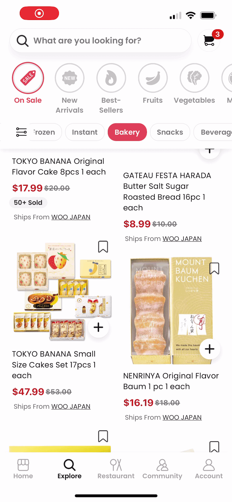
Seller-Specific Carts. Keep different shipping, delivery, and policies clear as you shop.
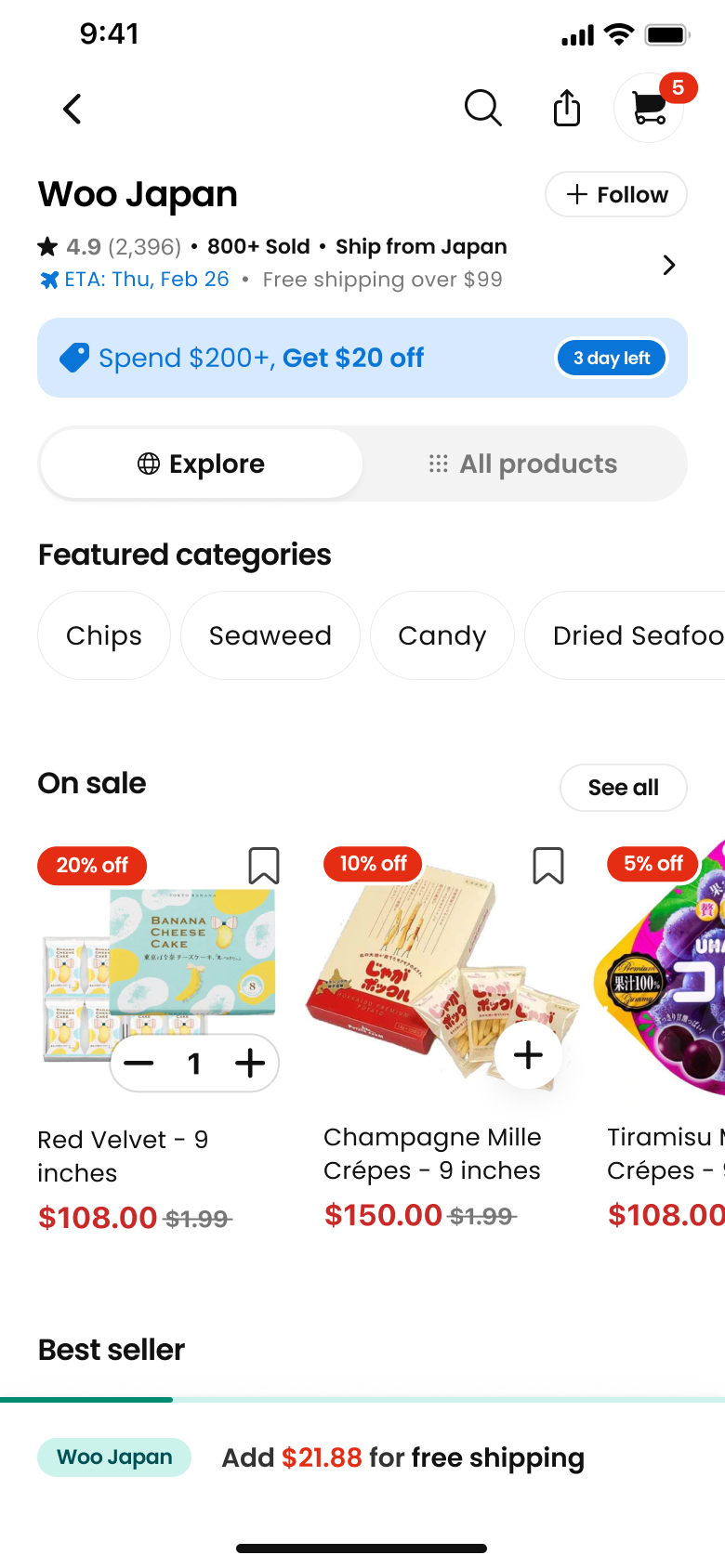
Seller Storefronts. Bring each seller’s identity, products, offers, and fulfillment details into one consistent shopping experience.

Seller ratings.
Build confidence with transparent feedback on shipping and service.

Multi-cart checkout. Choose which carts to check out, all in one place.
CORE SHIFT SUMMARY & IMPACT
From a one-off campaign page to a scalable marketplace foundation.
Original ask
A Black Friday campaign page for third-party products.
Scope expanded
Marketplace behavior across discovery, PDP, vendor storefront, cart, and checkout.
Operating principles
Familiar where possible / Explicit where necessary / Configurable within guardrails.
Key design decisions
Familiar journey / explicit marketplace differences / configurable storefront / reusable CMS patterns.
Impact
Marketplace bookings +10.2% / Marketplace orders +8.83%; Overall bookings +1.2% / Overall orders +2%.
It started as a Black Friday landing page.
INITIAL TASK
Leadership wanted a fast way to showcase third-party sellers for Black Friday.
WHAT I DID
I reused existing components to ship quickly, then mapped the downstream journey to understand what happened next.
WHAT I FOUND
The challenge went far beyond the landing page.
BOTTOM LINE
The page worked. The journey didn’t.
The problem: The business model changed. The customer mental model hadn’t.
Our shopping experience was built for one seller and one set of rules. Third-party sellers introduced different fulfillment, shipping, carts, and policies that the existing journey wasn’t designed to support.
1P
3P
Seller
Weee!
Third-party sellers
Fulfillment
Standard
Seller-specific
Shipping
Shared rules
Seller-specific thresholds
Cart & policies
One experience
Different rules
Balancing customer, merchant, and Weee! needs.
We quick conduct the interview with 5 of vendors and journey mapping, I found the problem was more complex than expected: Global+ had to balance the needs of customers, merchants, and Weee! at the same time.

MERCHANTS NEED
-
Storefront customization
-
Product promotion
-
Brand expression
-
Merchandising flexibility

CUSTOMER NEED
-
Seller transparency
-
Shipping clarity
-
Familiar shopping flow
-
Policy transparency

Weee! NEED
-
Experience consistency
-
Storefront scalability
-
Fulfillment flexibility
-
Customer trust
The program wasn’t just hard to use. It was hard to scale.
At first, it looked like an portal problem.But after connecting the data and research, I realized something bigger.
Before joining, affiliates depended on marketing to understand the program. After joining, the portal showed results but offered little guidance on how to succeed.
The design challenge wasn’t optimizing for one side. It was creating a model that worked for all three.
We aligned on three design principles.
The goal was to preserve what customers already understood, make the important differences clear, and still give merchants enough flexibility to operate within the platform.
FAMILIAR
Keep existing shopping patterns wherever possible.
EXPLICIT
Make marketplace differences clear when they affect decisions.
CONFIGURABLE
Support merchant flexibility within clear platform guardrails.

Good product decisions require balancing more than UX.
Each decision balanced research and A/B testing data with customer clarity, merchant flexibility, technical constraints, engineering effort, and long-term scalability.
Turning principles into product decisions.
Product Designer specializing in
e-commerce experiences.
Integrate Global+ naturally across the journey
Reuse familiar product, cart, and checkout patterns. Integrate Global+ naturally across the existing journey. Minimize learning while protecting the core purchase funnel.
FAMILIAR WHERE POSSIBLE


Reuse familiar product, cart, and checkout patterns
Product Designer specializing in
e-commerce experiences.
Use badges to make 3P products immediately recognizable.
Make marketplace differences explicit when they matter. Surface seller, shipping, and cart differences at the right moments. Set clear expectations before users commit.
EXPLICIT WHERE NECESSARY


Set clear expectations when users first add a 3P item to cart.
Product Designer specializing in
e-commerce experiences.
Give sellers flexibility to configure products, categories, and promotions.
Standardize the storefront with an A — Fixed Layer and a B — Configurable Content Layer.Give sellers flexibility within guardrails while keeping the Weee! experience consistent.
CONFIGURABLE WITHIN GUARDRAILS

Keep core store elements consistent across every seller.
HOW MUCH FREEDOM SHOULD A STOREFRONT HAVE?
More freedom helped stronger sellers express their brands, but it didn’t work equally well for everyone and started to create inconsistency. We explored different levels of flexibility.

DESIGN DECISION
Standardize the core. Make key modules configurable.
Seller needs varied widely, but the shopping experience couldn’t.
CONSTRAINTS
Different seller types
Single-brand ↔ multi-brand
Uneven content quality
Strong assets ↔ limited assets
Different catalog sizes
Few SKUs ↔ hundreds of SKUs
More freedom
Better seller expression
Higher CMS + maintenance cost
Less consistent storefront experience
More structure
More consistent and scalable
Lower seller differentiation
TRADE-OFF
Launch wasn’t the end. Post-launch data kept shaping the product.
01. EXPECTATION- DRIVEN ITERATIONS
When we launched the first version, returns rose to 1.3%. Follow-up interviews revealed the key issue: visibility created awareness, but not understanding. Users needed clearer expectations before cart and checkout. The new design return rate from 1.3% to 0.5%
BEFORE


1.3% return rate
Awareness ≠ understanding
AFTER


1st time callout
Follow up reminder
Clearer expectations earlier
Return rate 1.3% → 0.5%
02. UGC SCALE - DRIVEN ITERATIONS
At launch, there wasn’t enough review content to justify primary navigation. As UGC grew, we moved Reviews into the main navigation, improving add-to-cart by 4% and showing how the right information architecture evolved as the marketplace matured.
BEFORE


Review content was still limited.
AFTER


Reviews reached meaningful scale.
Add-to-cart +4% on storefronts.
Takeaway.
1. TRUST YOUR DESIGN JUDGMENT AND SHOW THE EVIDENCE.
The biggest shift was recognizing that this wasn’t a landing page problem — it was an end-to-end marketplace problem. I used research and journey mapping to reframe the scope and shape a marketplace experience that fit an existing customer mental model.
2. GOOD DESIGN IS ABOUT KNOWING HOW MUCH IS ENOUGH.
Too much would create friction and make the experience feel intrusive. Too little would hide important marketplace differences and reduce business impact. The key was finding the right level of intervention at the right moment.

